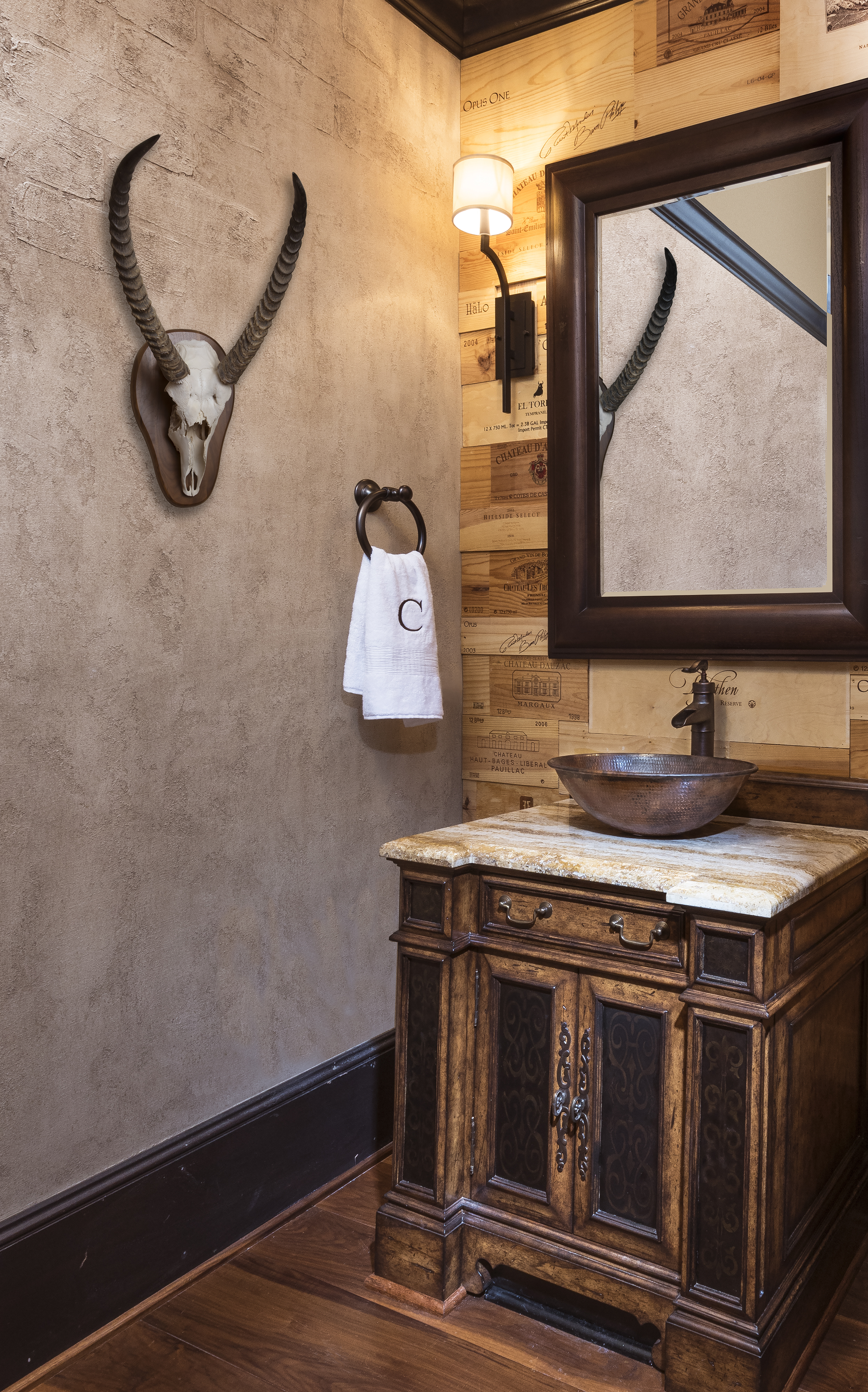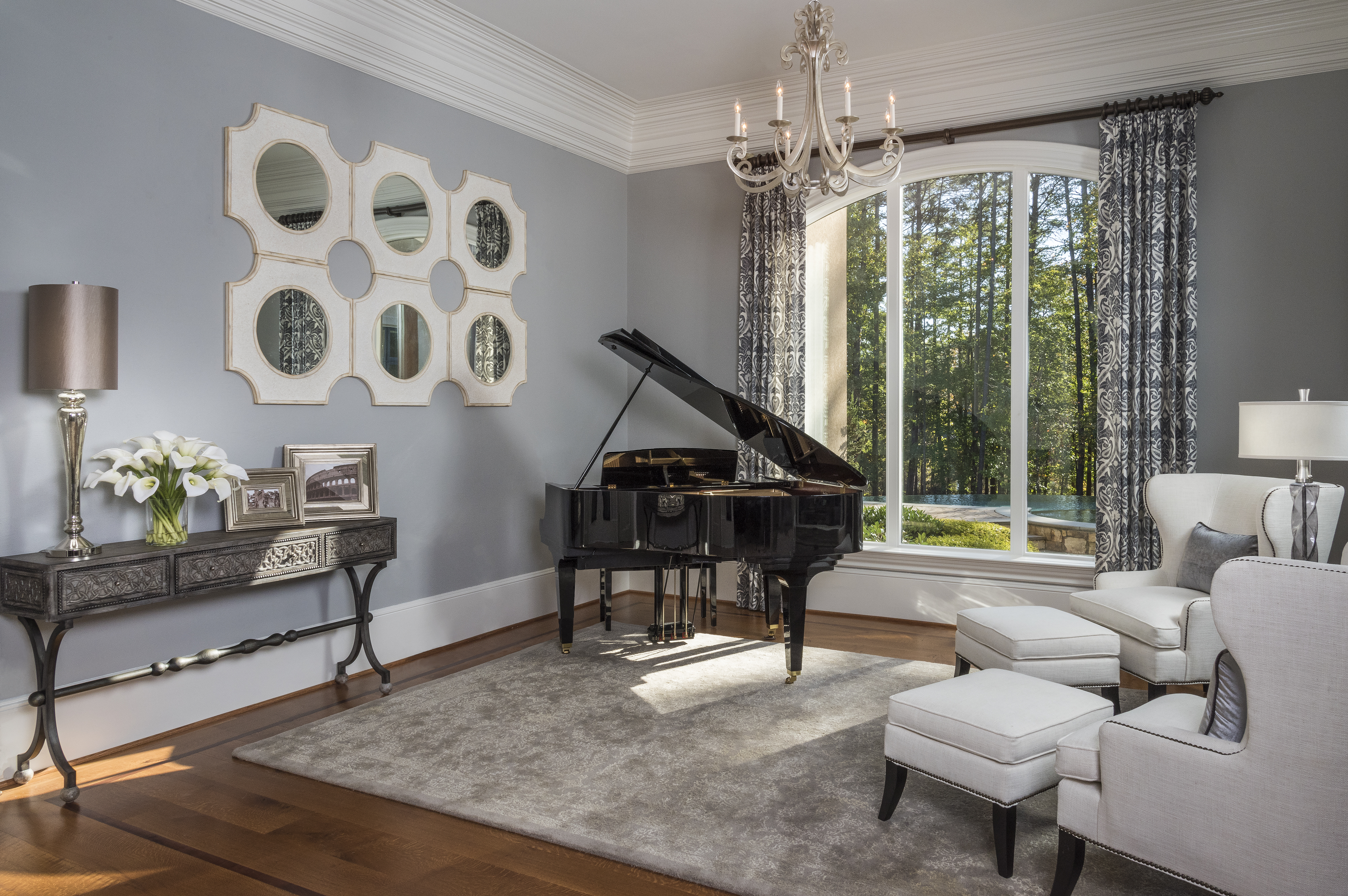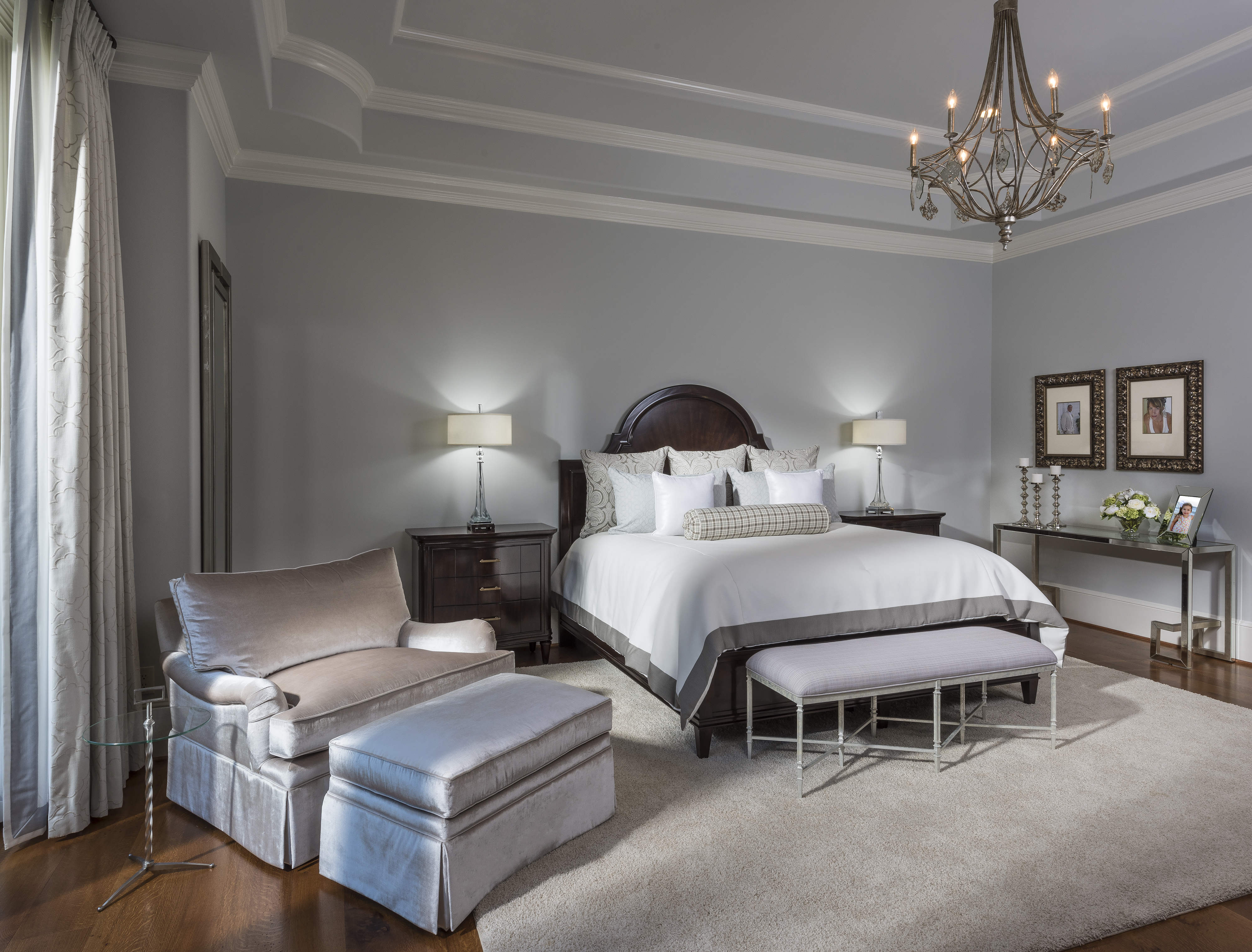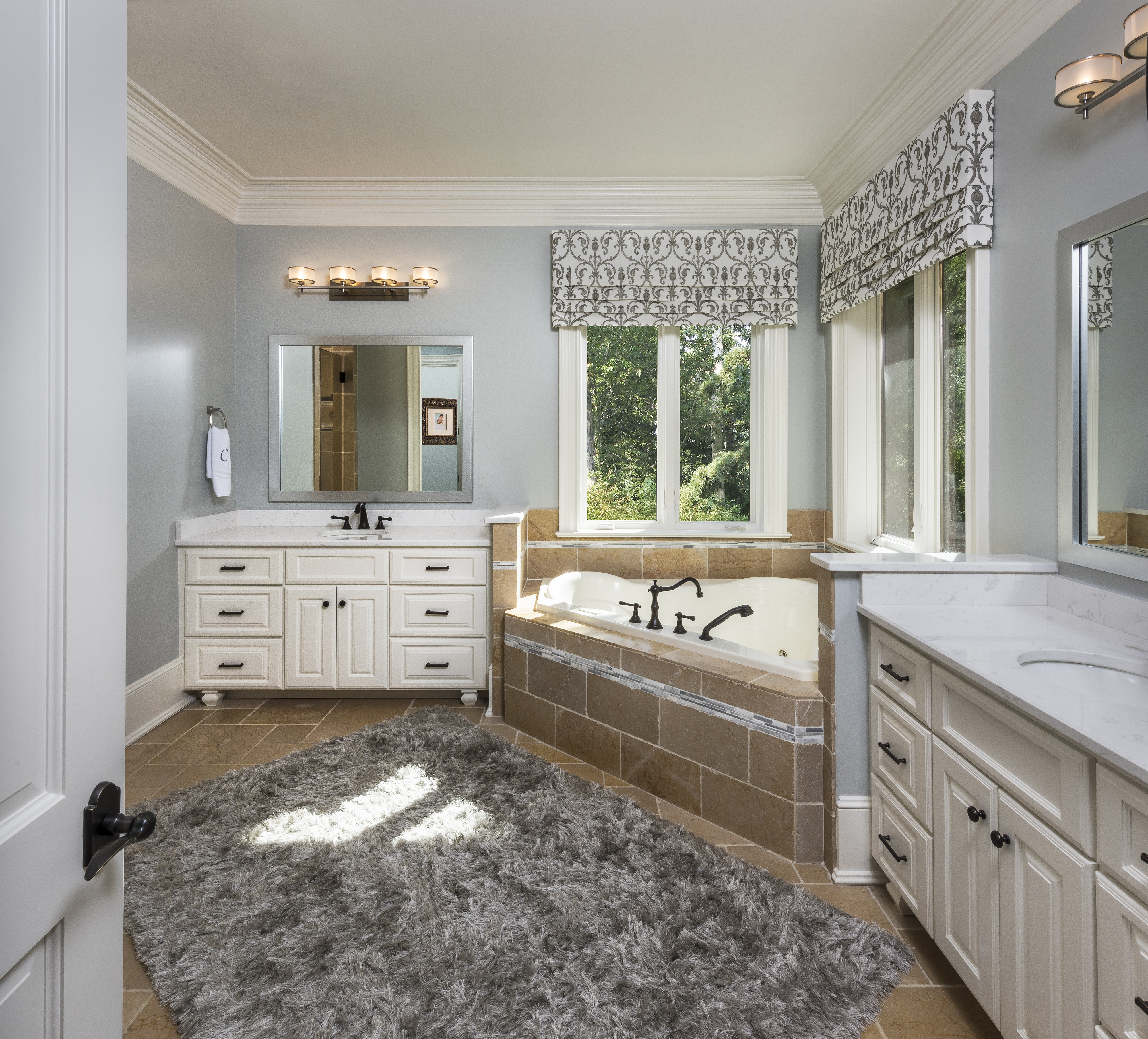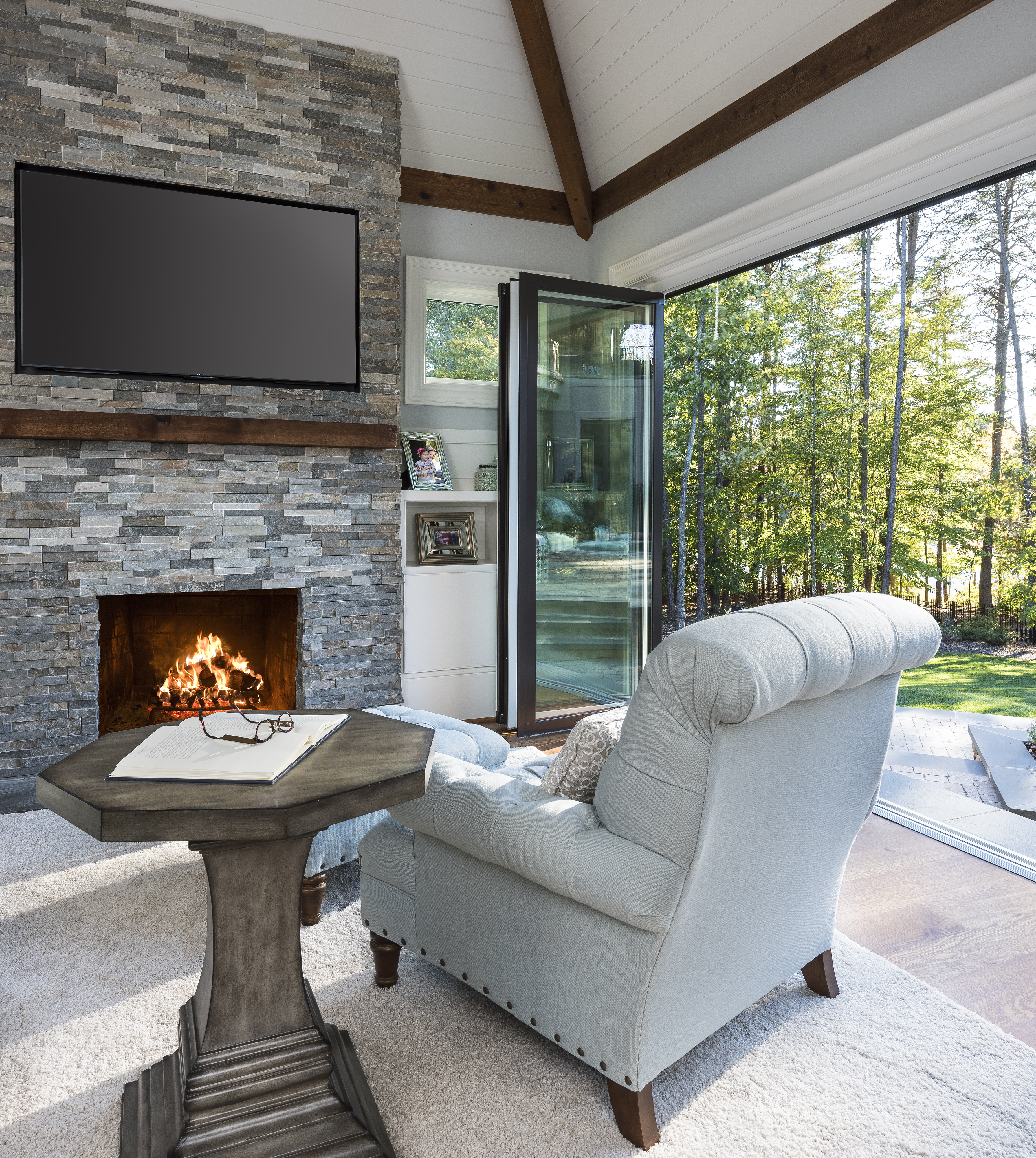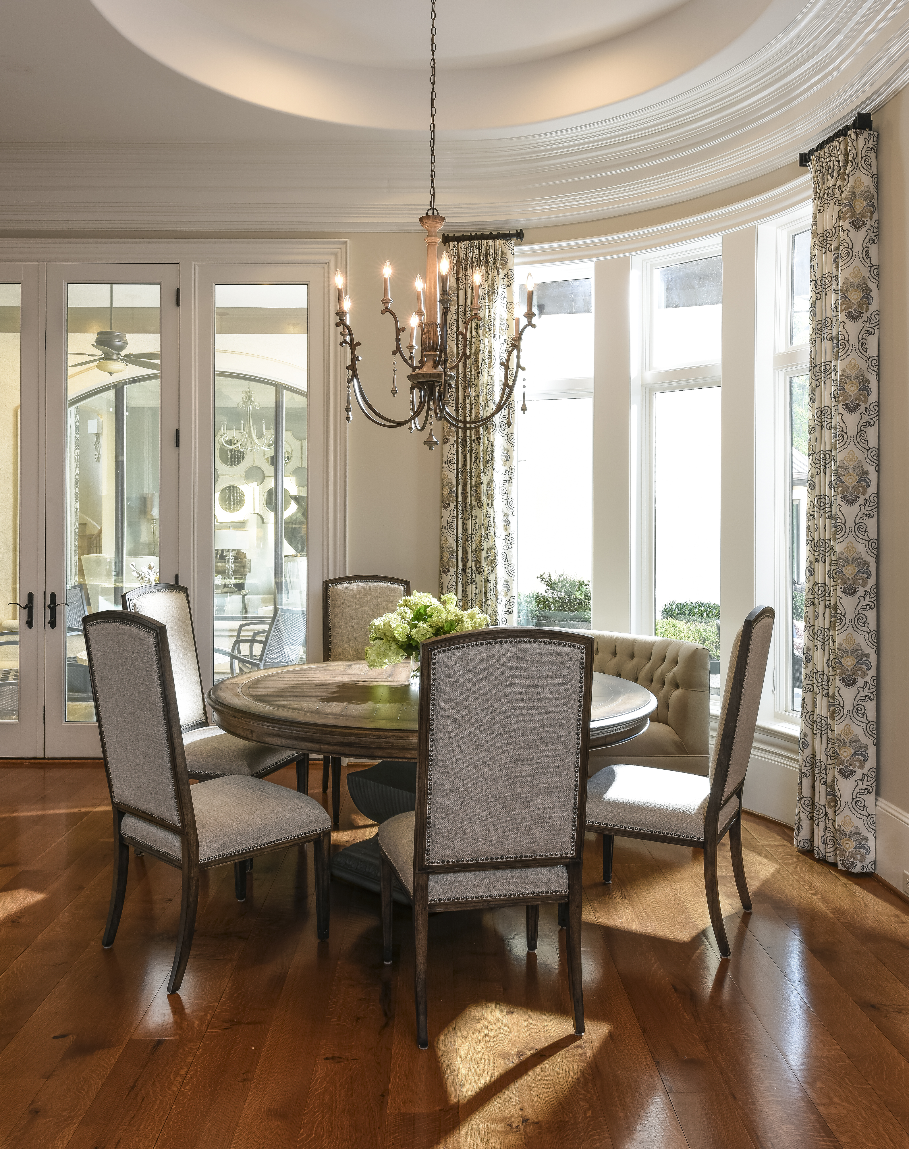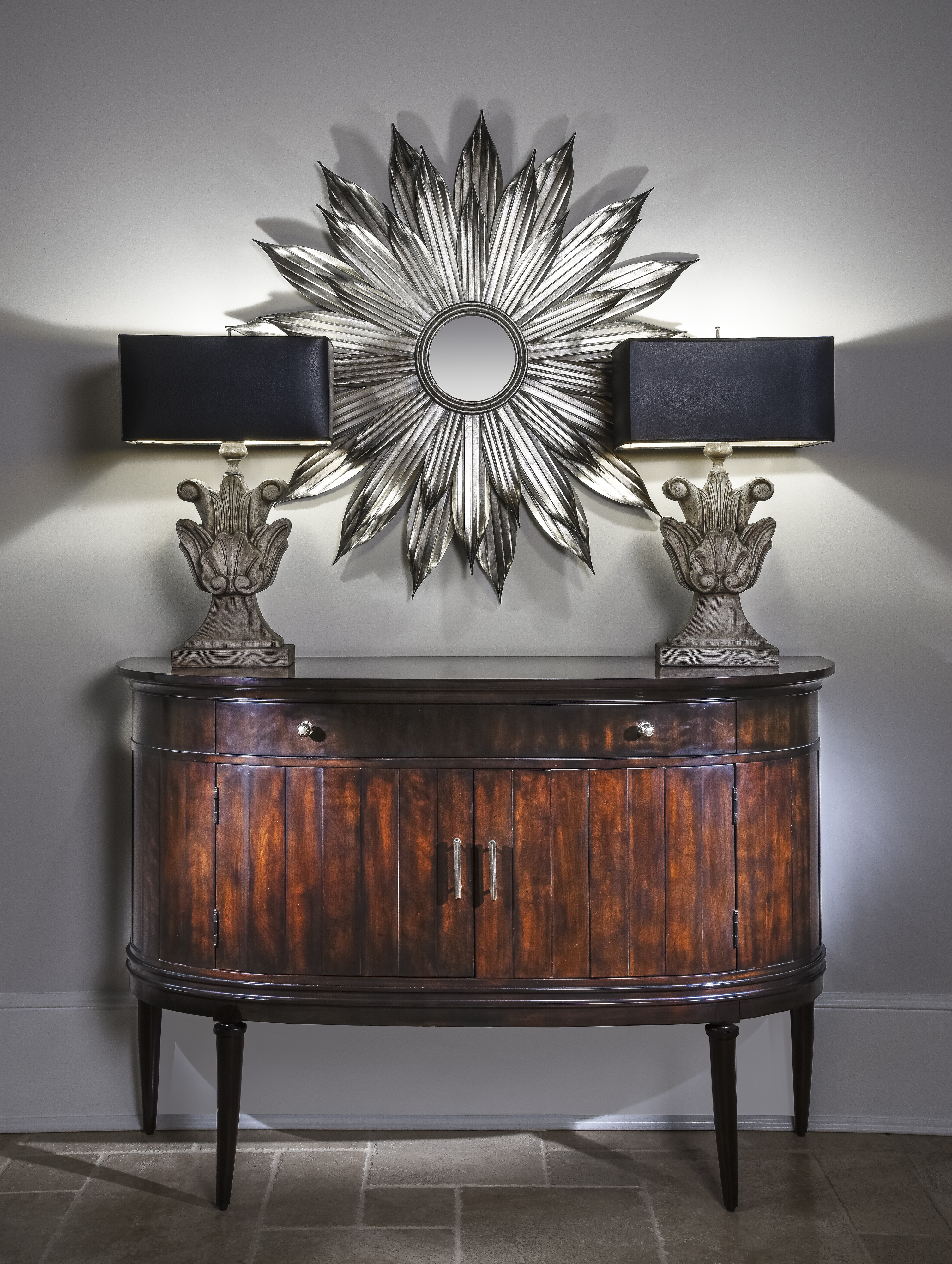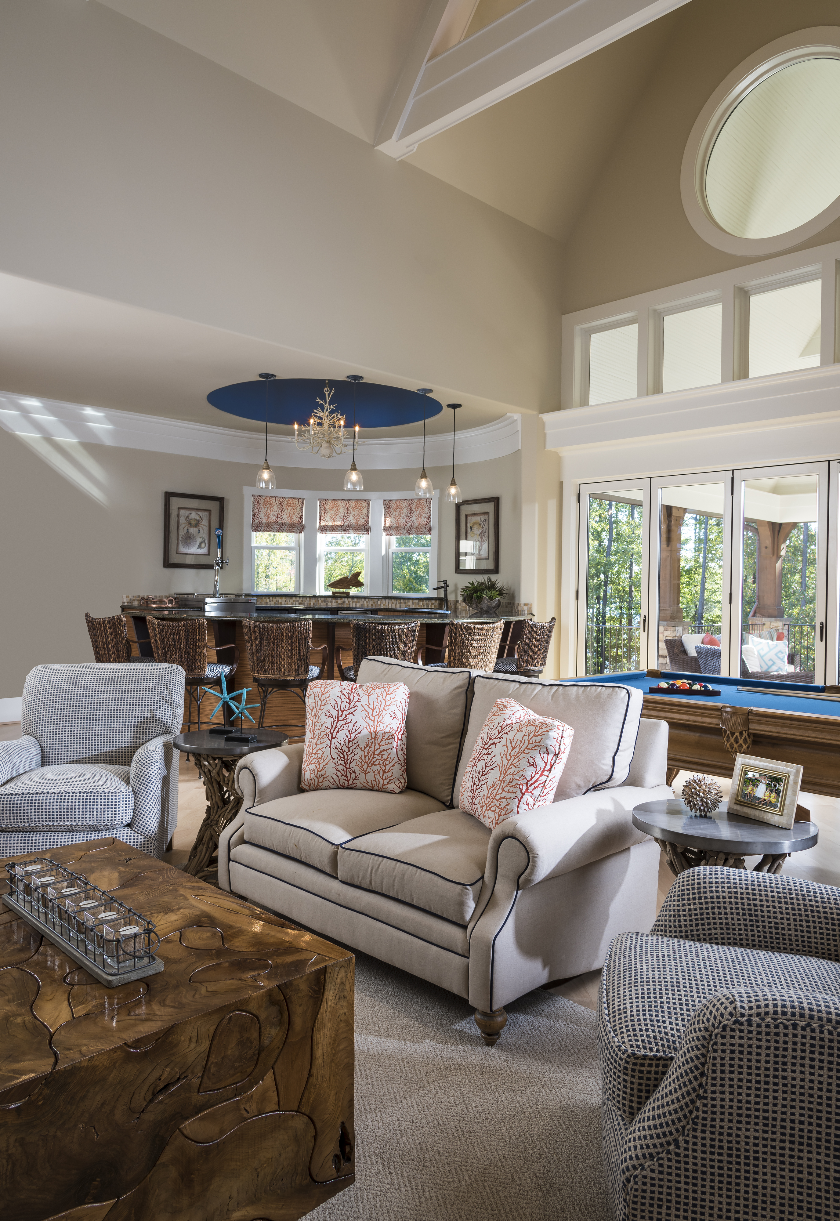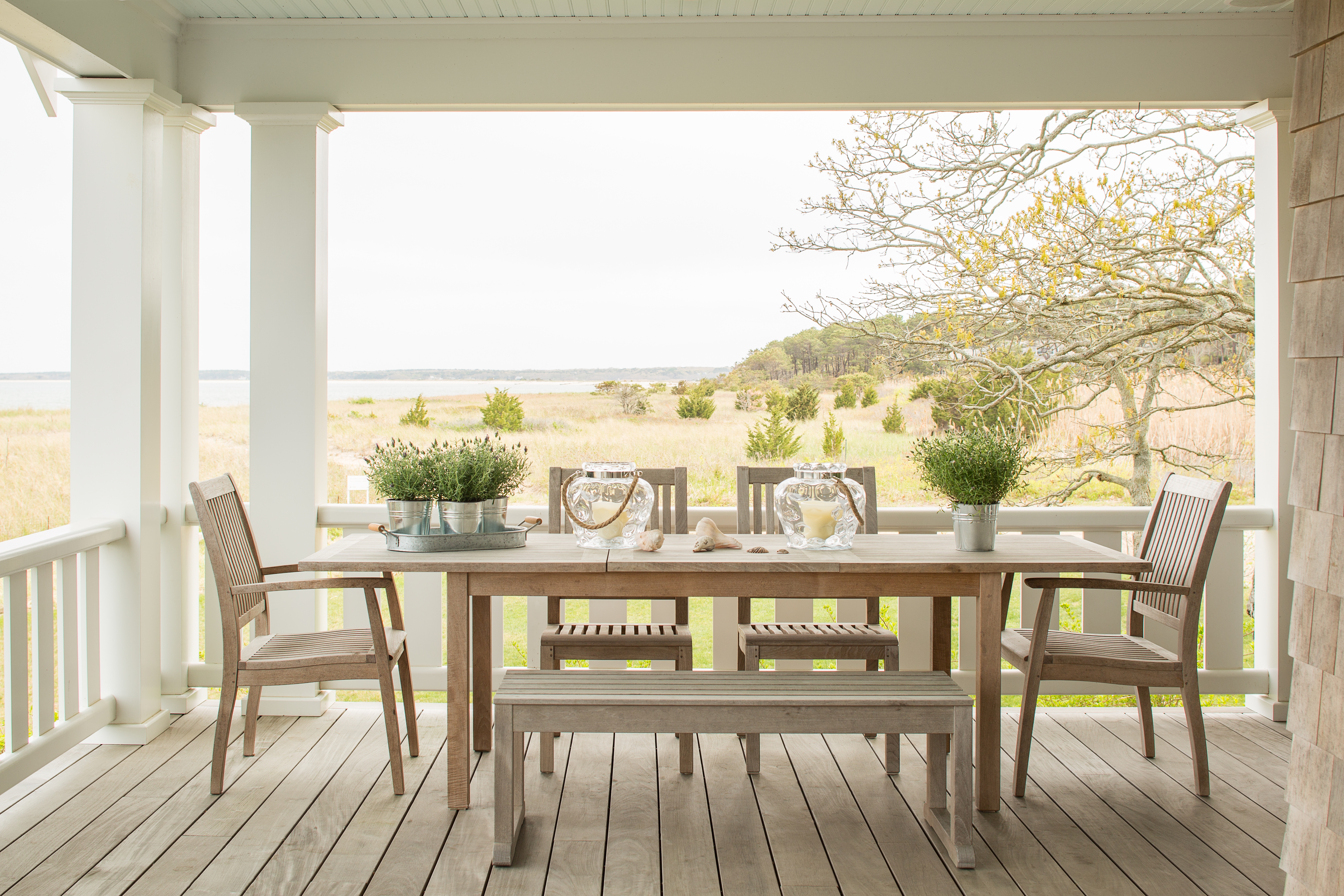
After spending her childhood in Hyderabad, a busy metropolis in the south-central portion of India, designer Vani Sayeed did not expect to expand her career in the quaint suburb of Newton, Massachusetts. But now that Sayeed has spent more than a decade living in New England, her work reflects the cultural influences of her beloved home blended with the relaxed, seaside style of the East Coast.
How did your upbringing—specifically your mother’s penchant for art—influence your creative development?
Growing up in Hyderabad—a city rich in culture and history—I learned to value aesthetics from a very young age. My mother is a very artistic and creative person who shaped a lovely environment for us to grow up in. Between my external and personal milieus, my education and career in art and design was a natural progression.
When you moved to the US in 1998, you began your career living and working in San Francisco. What motivated you to move to the East Coast?
Working in the Bay Area was phenomenal. I was four years into owning my own design studio and slowly growing my business each year when my husband was offered a fantastic opportunity in Boston. It was a hard move, but it was the right decision for us as a family, and the opportunity has opened so many different doors for me to reinvent myself.
Now that you work primarily in New England, how has your style evolved?
There are no clear-cut solutions in my studio. My work is influenced by all of the places I’ve lived in and traveled to, as well as my life experiences. I try to bring a “global chic” vibe to the spaces I design. With that being said, I love the natural beauty of New England—the region’s distinct seasons, rolling hills, big, blue skies, seaside towns, and beautiful architecture. All of that can’t help but seep into the way I design for local projects. In my mind, it’s very important that spaces sync with their overall environment.
One of your recent projects in Martha’s Vineyard is a great example of this quaint seaside style. What was the goal for the clients and their expectations for the space?
The clients in this project were a young family with little children and dogs, and they wanted a space that was easy to use and family-friendly. We took cues from the neutral colors and materials found in the environment around the home and worked to achieve the relaxed vibe they were seeking.
What was your first step in developing a strategy for this space, and what elements were most important to consider?
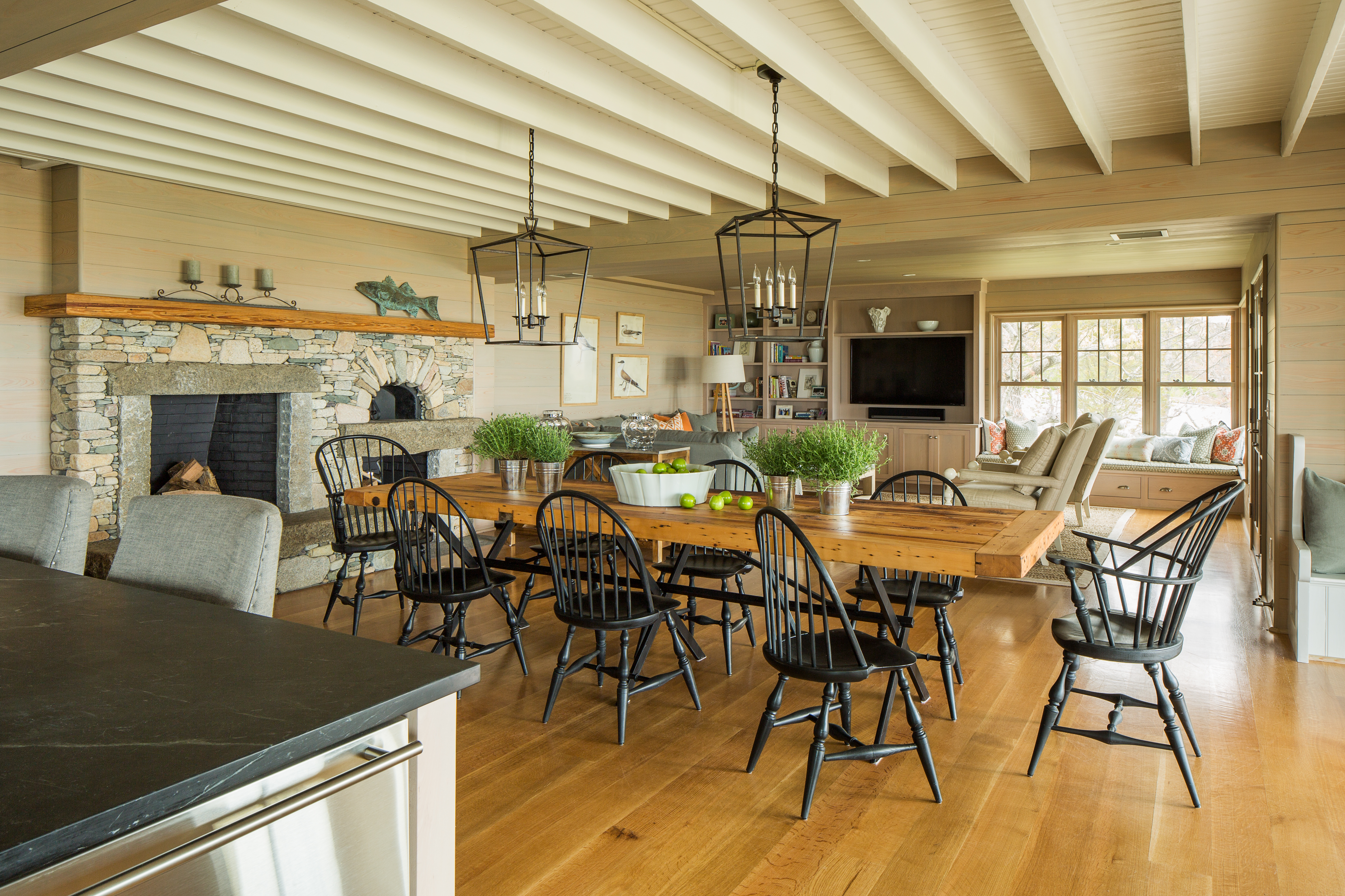
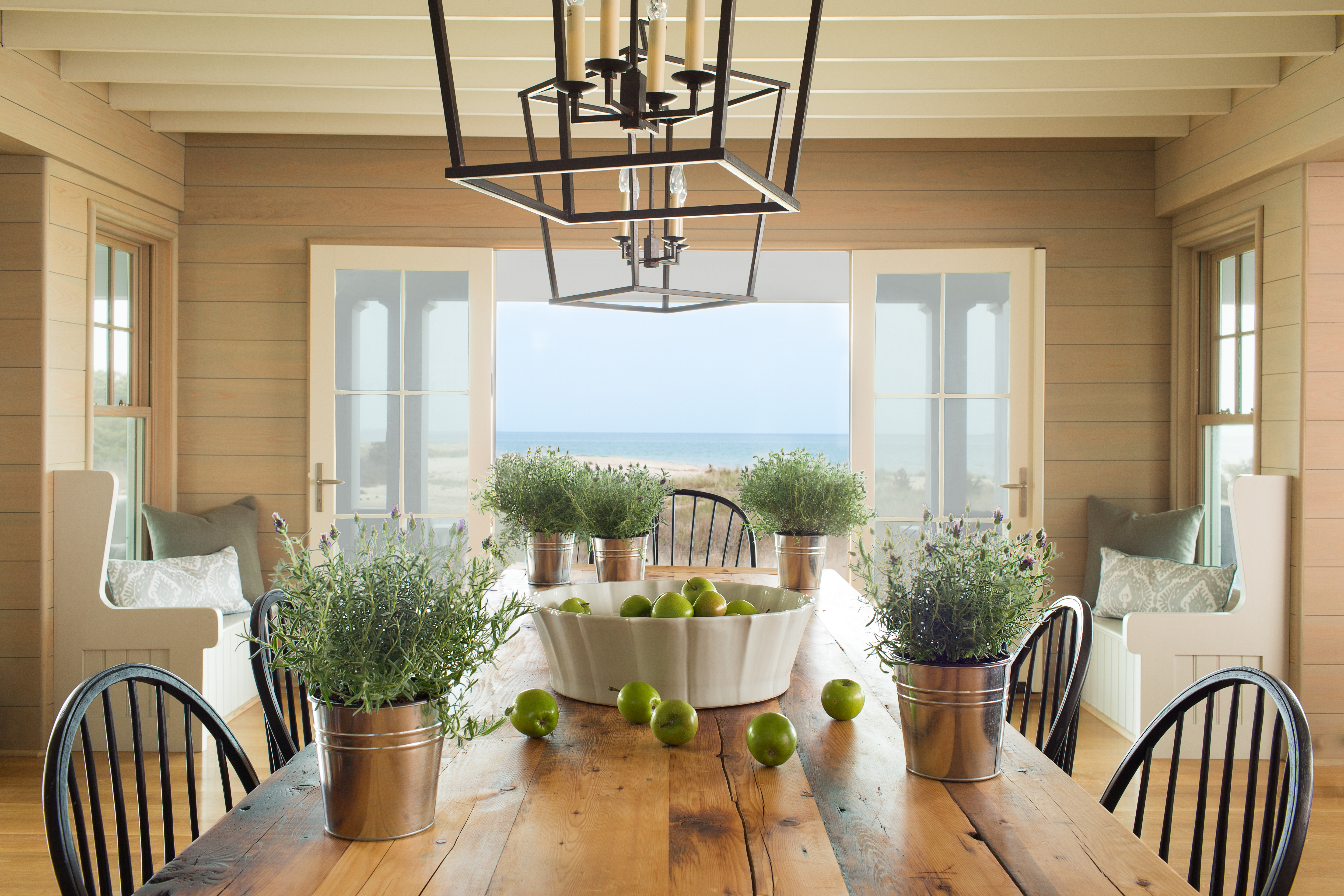
Like most homes in the area, this house was originally built in the 1920s and needed to be lifted onto a newly built foundation. The previous layout consisted of small rooms, with the kitchen sequestered behind the public spaces—cut off from view. We began by reconfiguring the space with the help of William C. Sullivan (of the architecture firm Sullivan + Associates Architects) to be more functional for a modern family, with lots of wide-open space. We took down walls to create this more expansive great room situated toward the water, with three sets of French doors that open out to the porch. This helped create a nice flow between indoor and outdoor living.
Did you maintain any of the home’s original framework or features? Or did you have to essentially begin from scratch?
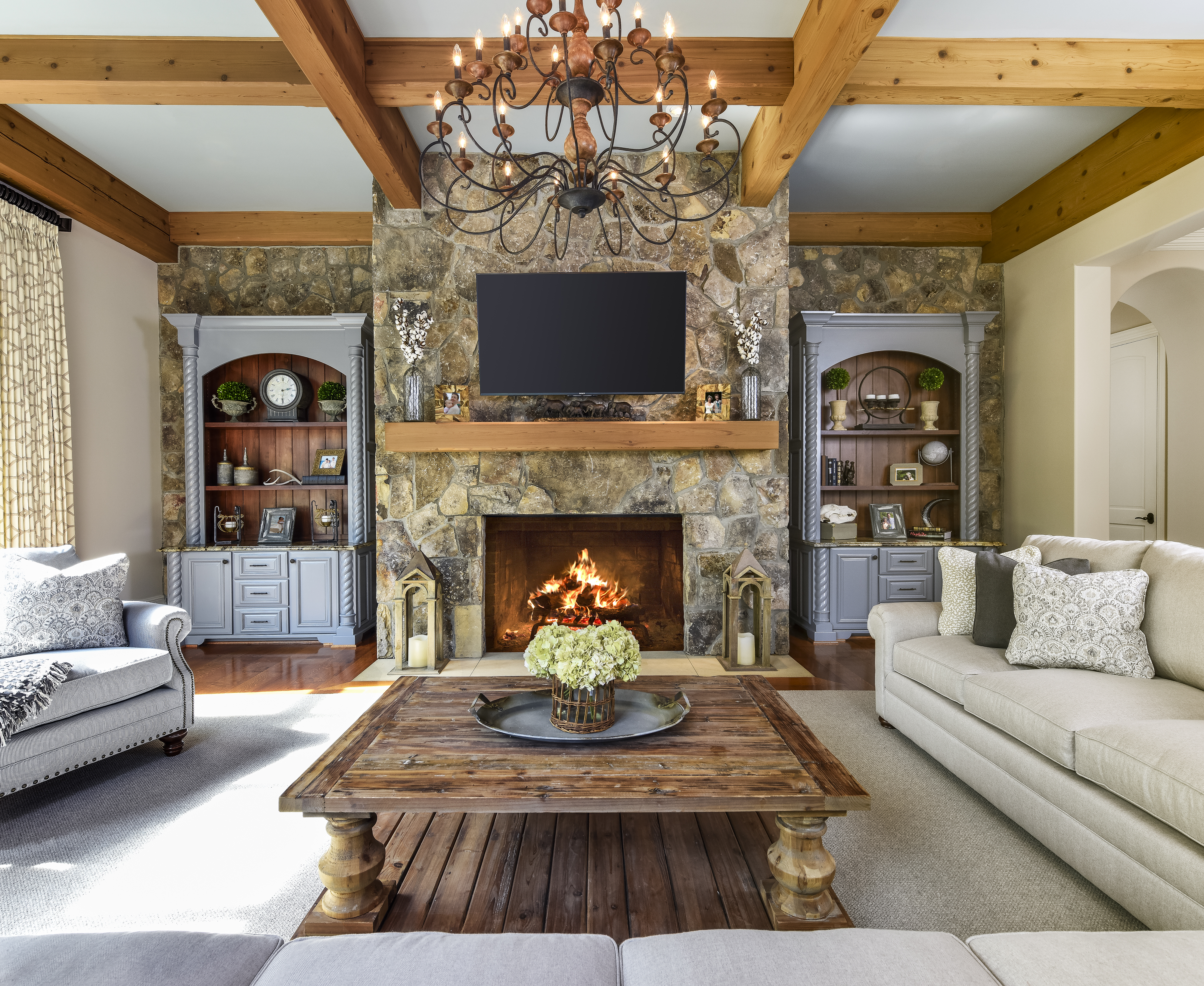
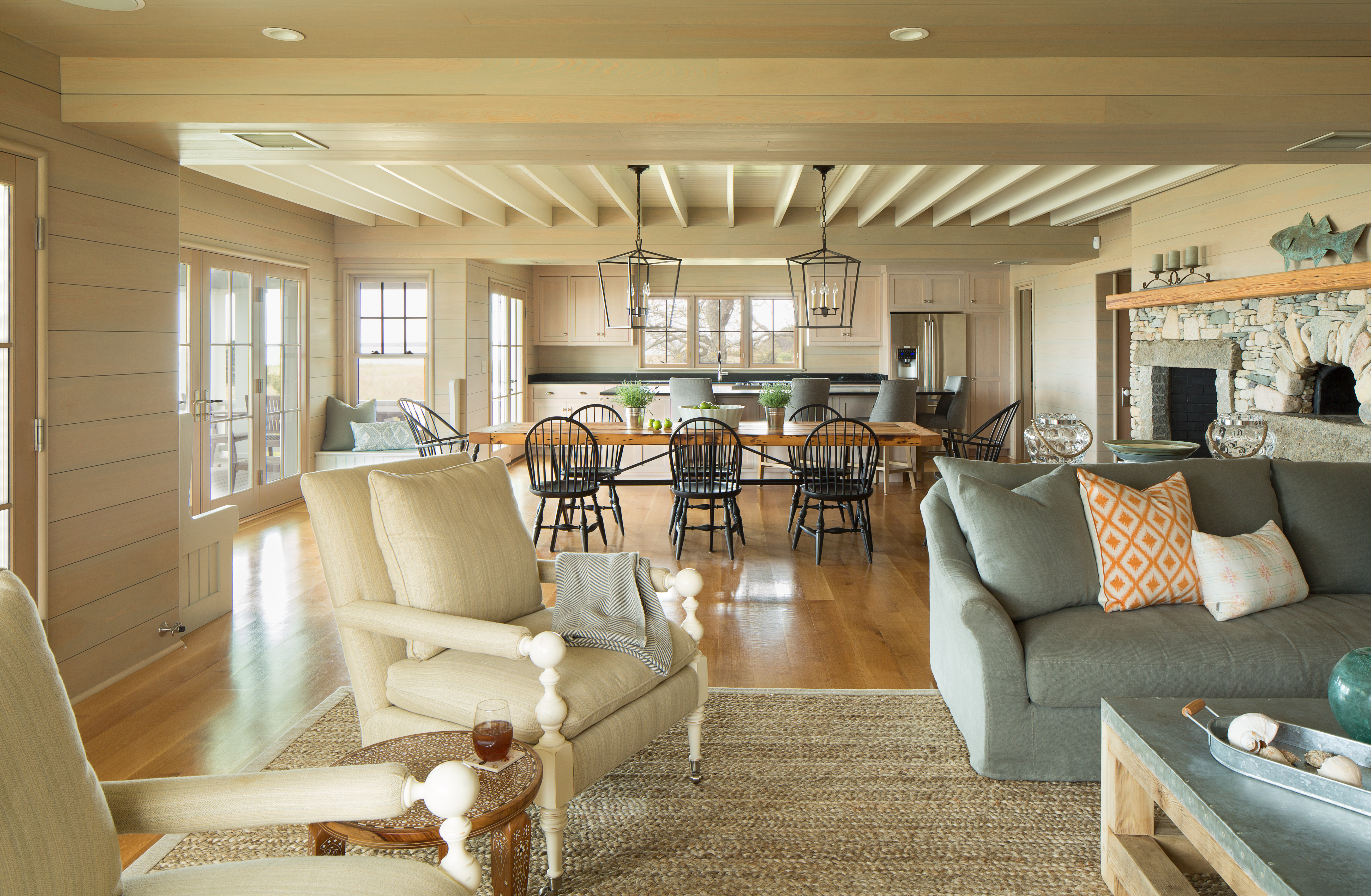
We kept the original beams and beadboard on the dining room ceiling. I thought they set a modern, pared-down tone for the space while echoing the neutral color scheme. We worked to find just the right gray-tinged wood stain, to which we matched the kitchen cabinetry and built-ins in the living room. All of these elements work together to keep the space cohesive.
Speaking of cohesiveness, the space is very simplistic, but there are pops of color every now and again. How did you preserve this unified look without the design looking too monotonous?
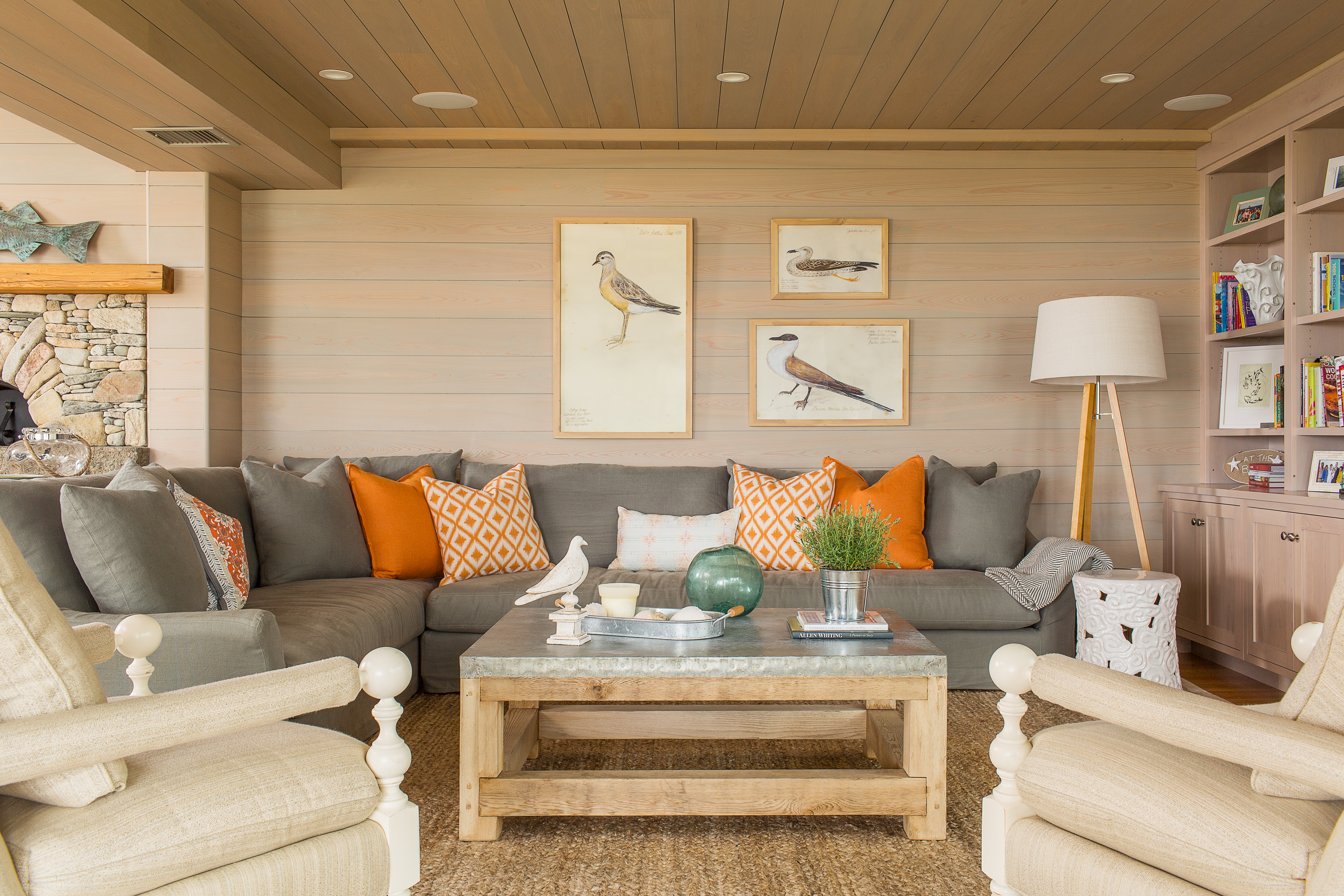
The touches of salmon and bits of green were inspired by the shrubbery and shells found on the property, which made for a wonderful but unexpected surprise in an otherwise neutral space. These colors are the perfect backdrop for the modern-meets-hand-hewn furnishings. The clients wanted a low-maintenance space, and this sentiment is honored in every room.
What are some of the finer details in this space that contribute to its understated yet comfortably luxurious appearance?
The family invested in solid pieces that will stand the test of time, including Windsor dining chairs with a matte-milk finish, a sturdy, tin-covered, reclaimed-wood coffee table, and a large sectional sofa. The soapstone counter in the kitchen is traditionally oiled to keep its dark color, but the clients left it patina to add character and for easier maintenance. The accessories with a global feel enhance the design with a little more color and texture without disrupting the quiet.
The bedrooms, in particular, are very minimalistic in terms of furniture and color. Was this
a strategic move based off of the pieces that the family already owned?
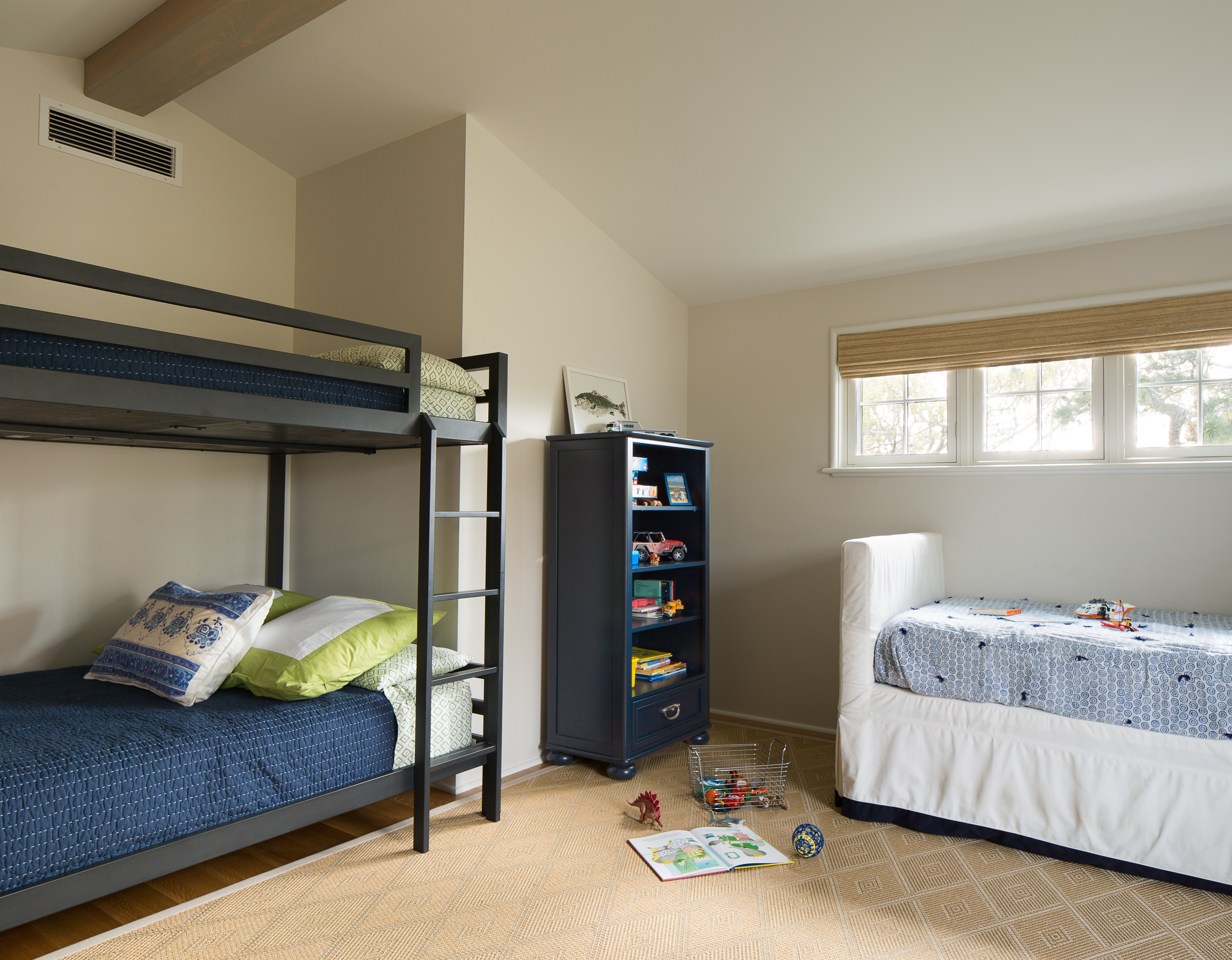
The clients requested unique, custom-designed, and hand-block-printed cotton textiles for the bedding and upholstered furniture. The art on the walls is sourced from local artists in the Boston area. The simple, light tones also make the most of the slope and pitch of the ceiling lines in the bedrooms, which give these spaces dimension and interest as the light hits the angles differently throughout the day.
How do you know when a particular design is finished? Is there an “aha” moment when you can sense that a room is complete?
In my view, there is never a definite end to designing a room or space. I will often leave a few walls empty so that clients can add art to their collections. During space planning, I make sure to float some pieces of furniture, too, so they can be moved around for a specific occasion or just to refresh a space. Sometimes less is more, and sometimes more is more—it all depends.
You emphasize collaboration in your design philosophy. Is this the most important goal you set when taking on a new project?
Clients invite me to a project because they trust my design judgment and expertise. That being said, the trust has to extend beyond the technical aspect to the artistic end, and part of my job is to understand my clients’ vision for the space. I must advise and steer them in the right direction, and this process is based on mutual respect and understanding. You have to give some, and vice versa.
For more info, visit vanisayeedstudios.com.
Share this beautiful New England home design with friends and family.
