What is your background when it comes to design? When did you open your own business?
I initially got my start in the field back in 1996, but I didn’t launch my own design firm until December of 2009.
What types of design feed your creativity on a daily basis? What do you find yourself constantly checking out?
I’m obsessed with couture fashion and how symbiotic it is with interior design and other aspects of our culture. Anything that Jean Paul Gaultier, Balmain, or Elie Saab showcases on the Parisian runway captivates me. I find myself also drawing inspiration from the architecture designed by ancient civilizations like the Egyptians, Greeks, Romans, and the first Persian Empire.
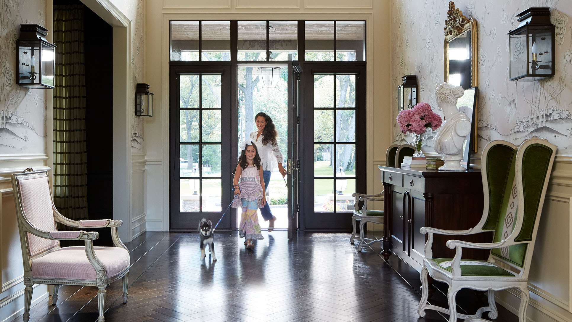
What sets you apart from other designers?
My candor—I keep it real. I tell it like it is, and I’m not ashamed to share the setbacks and struggles I’ve experienced in my past. I want to help others find their way and that sometimes means dropping the pretense. People value transparency, so they relate to you more when you’re being your authentic self. We have more in common as a human species than we know.
Who is your ideal client?
My ideal client is the one who communicates what they want (even if they don’t know what they want—admitting that part is half the battle) and trusts my vision. Also, my staff and I strive to always be respectful and hospitable to our clients, so clients who treat us with kindness and honesty are highly valued.
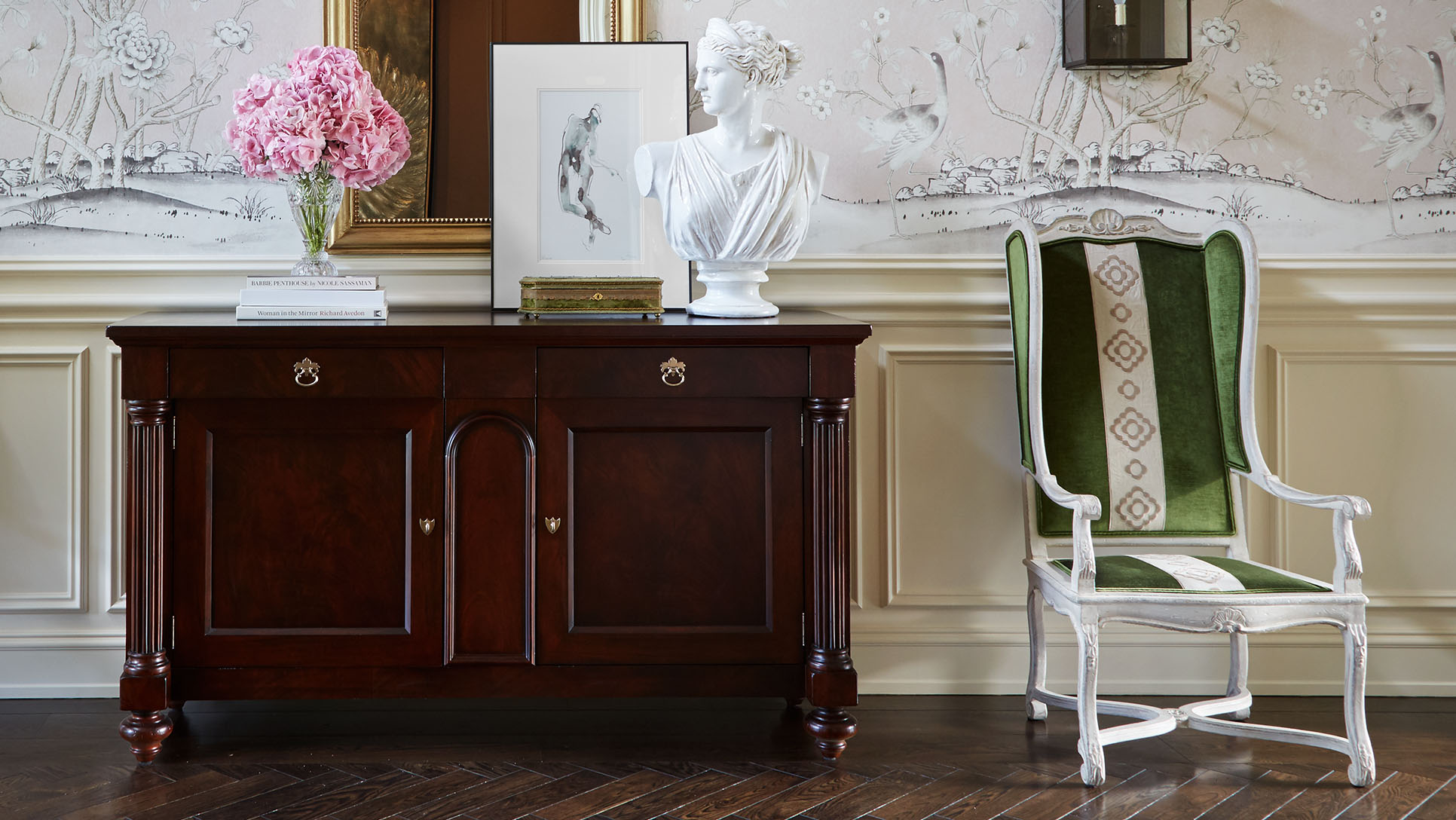
What traits make you well suited to be a designer? What are some challenges you’ve had to overcome?
I always tell young design students that the most important skill they can have in this career is not necessarily the degree, the ability to sketch, or other technical abilities. Rather, humility is the most important quality to possess. Humility keeps you grounded. It is the only mind-set that enables you to learn from your mistakes and grow.
Tell us about this project:
This ranch was a new construction project, so I was thrilled to work with a superbly talented team of architects, builders, and craftsmen. The interiors are traditional in style, but there are some rustic and French country influences as well.
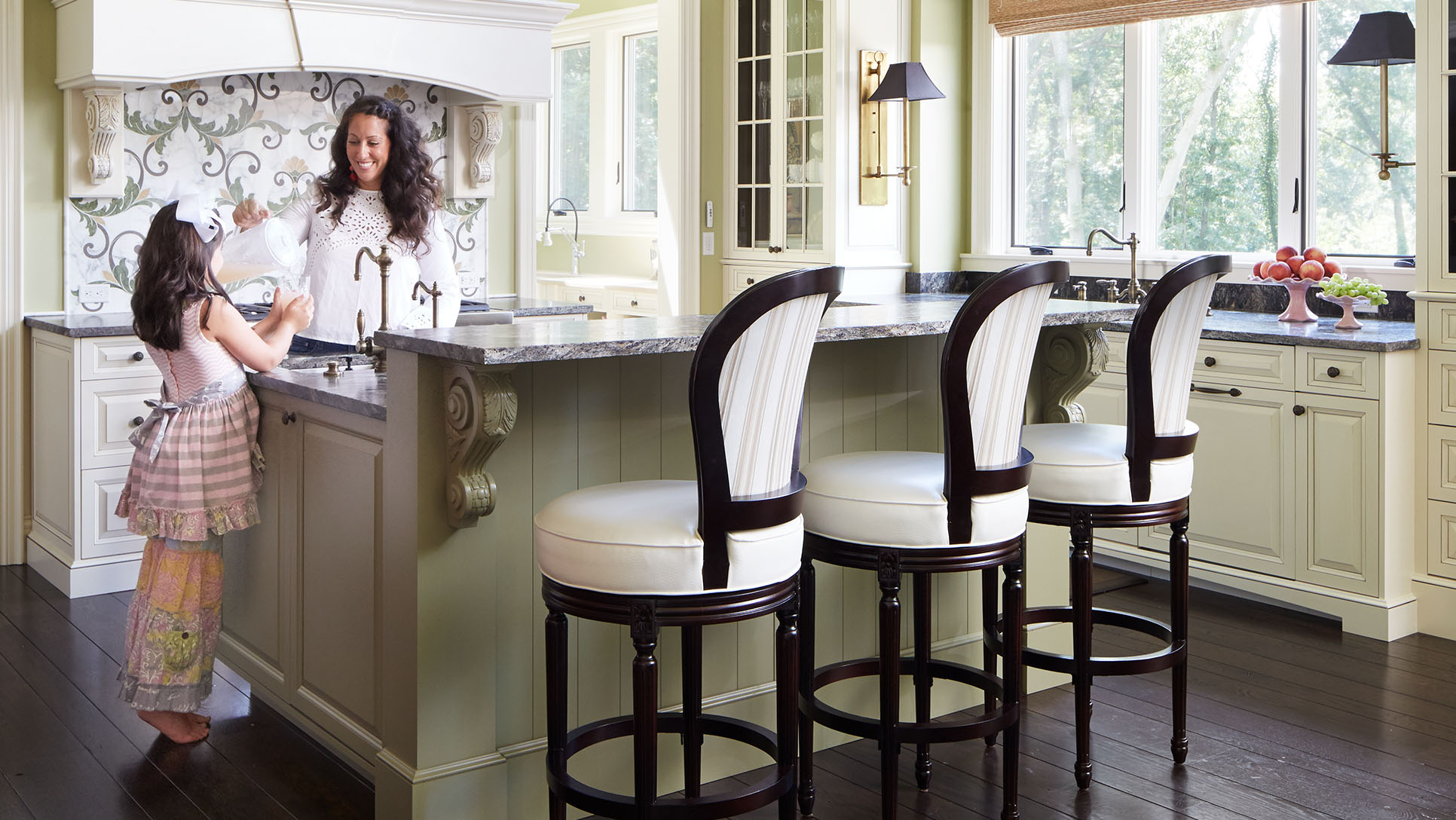
What was the goal of your clients for the house?
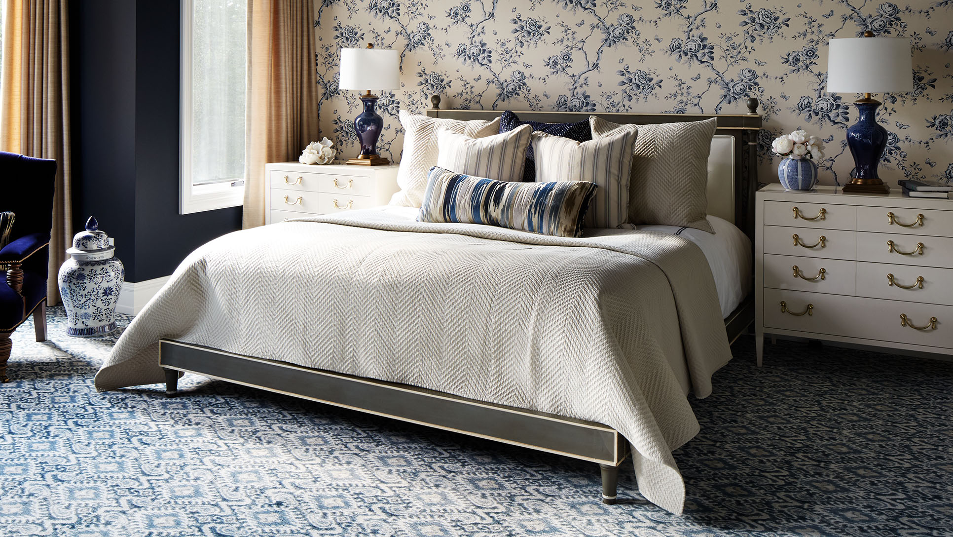
The goal was to take the husband’s and wife’s very disparate style aesthetics and somehow fuse them into a cohesive look. She loves pink, toile, and florals, and he ... does not. So that was the primary challenge, and it all came together beautifully, thanks to a ton of communication and compromise!
What were your first steps in conceptualizing the design of the house? How would you describe the style of the finished project?
Usually, I start designing a new space by conceptualizing it on paper. Hand-drawn, three-dimensional room sketches go a long way toward helping a client visualize the ideas. From there, we started pulling the color palette together and fleshing out the other design elements for construction.
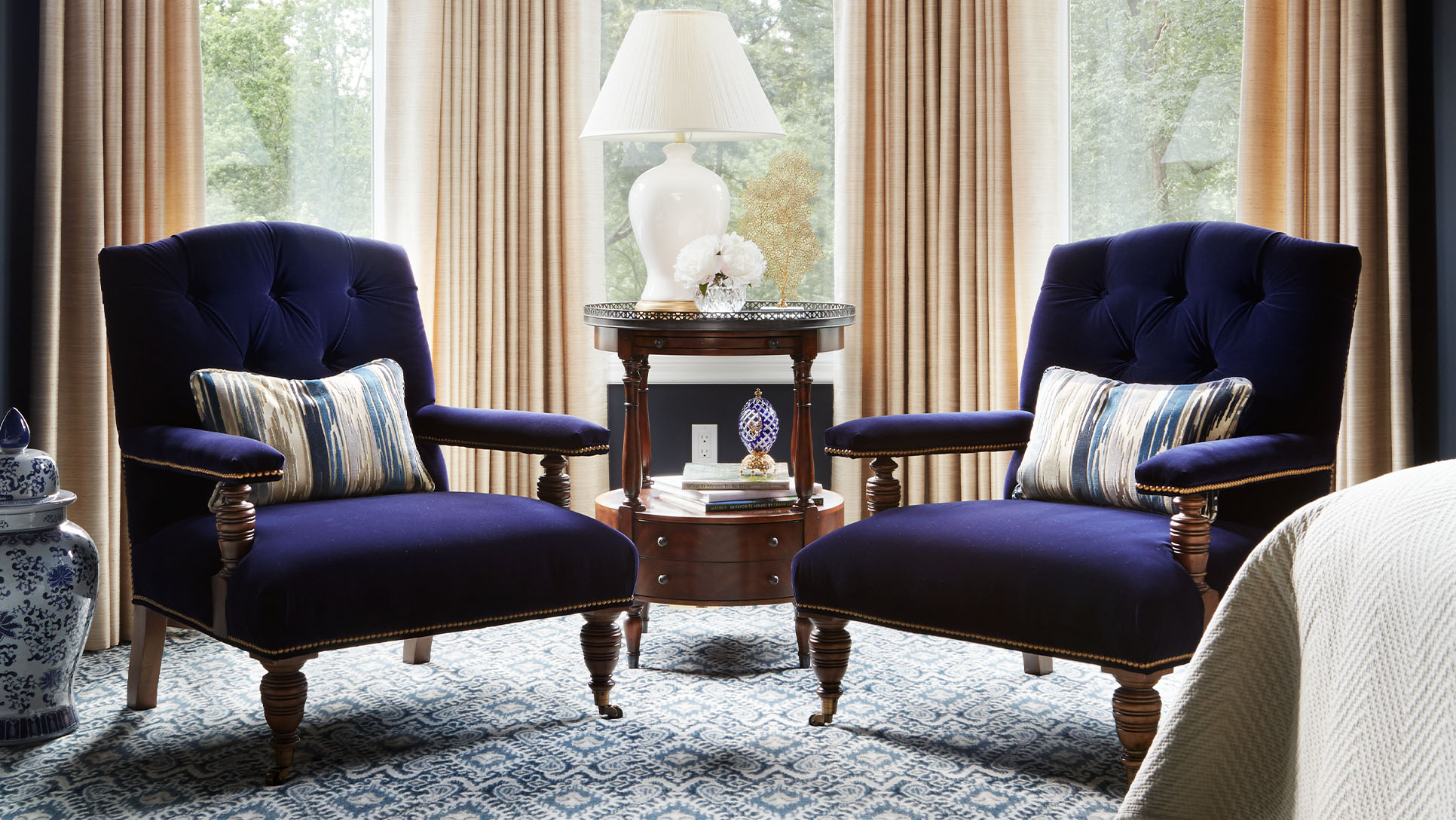
The lighting is very dramatic in the parlor and great room. Can you talk about the chandeliers?
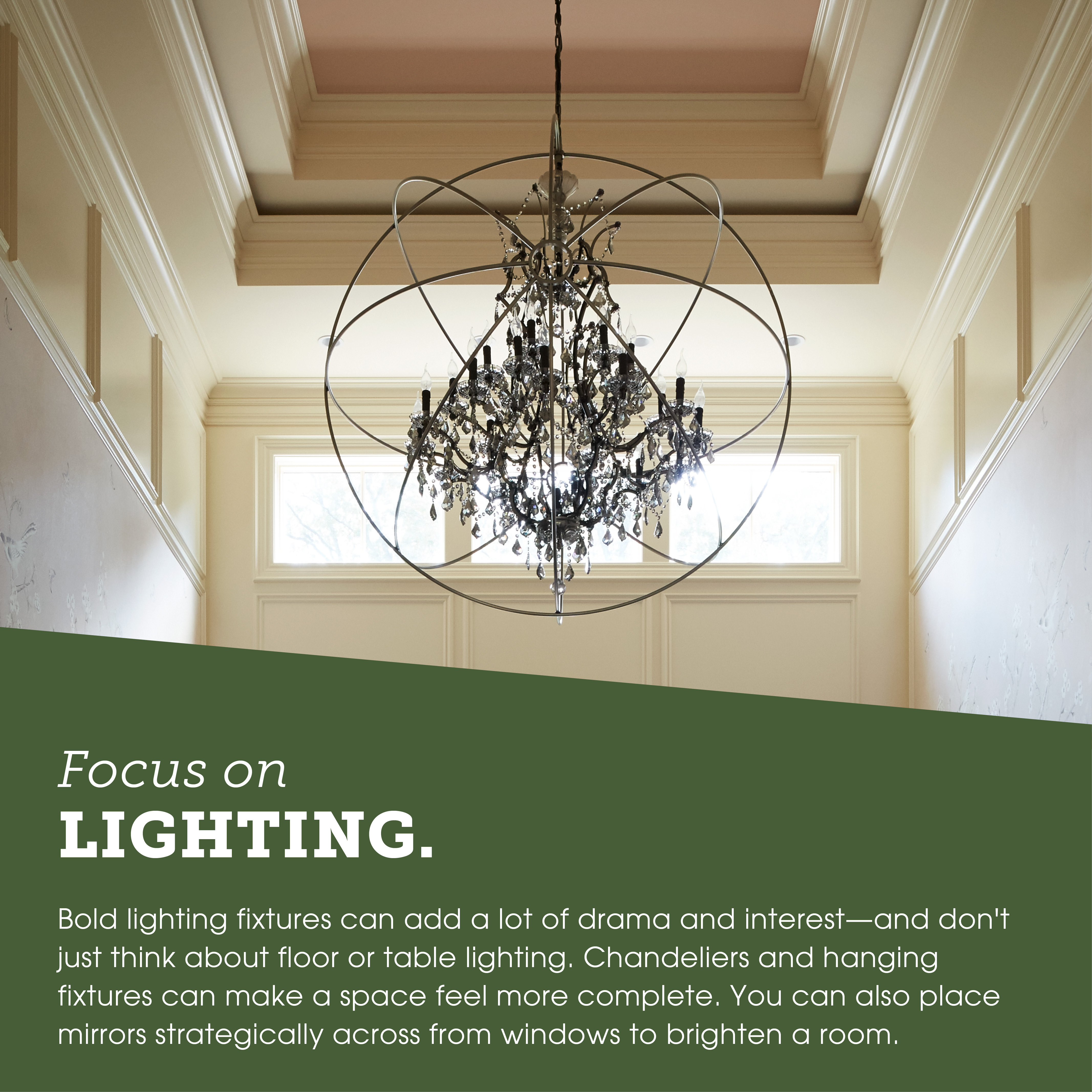
I believe in going big or going home when it comes to chandeliers, especially with twenty-foot-tall ceilings such as these. So for the parlor and great room, I chose oversized selections to make a stronger statement. Chandeliers can be more than ambient sources of light—they can also perform as sculptural art.
What was your favorite room to design? Which room was the most challenging?
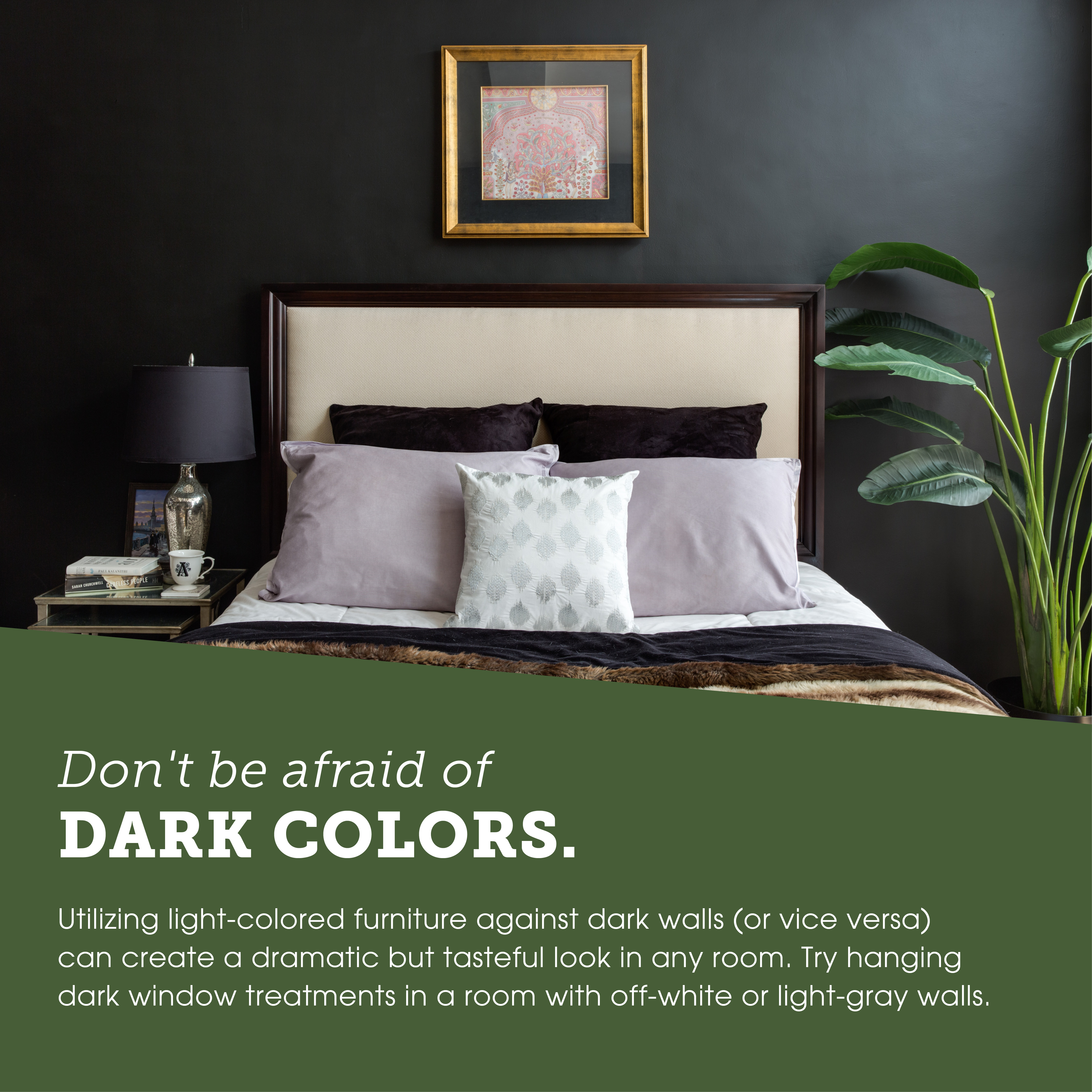
My favorite room is probably the formal parlor. I think it turned out so provocative, with its dark chocolate walls and moldings. It was a challenging space to design, too, only in that it took some effort to convince the clients to sign off on such a dark hue. But when you couple a rich paint color with brighter furnishings like art and mirrors, it actually produces a powerful impact. The great room was also a lot of fun to design, especially with the blush pink sofa. The husband wasn’t exactly sold on that idea at first, but now it’s his favorite place to crash.
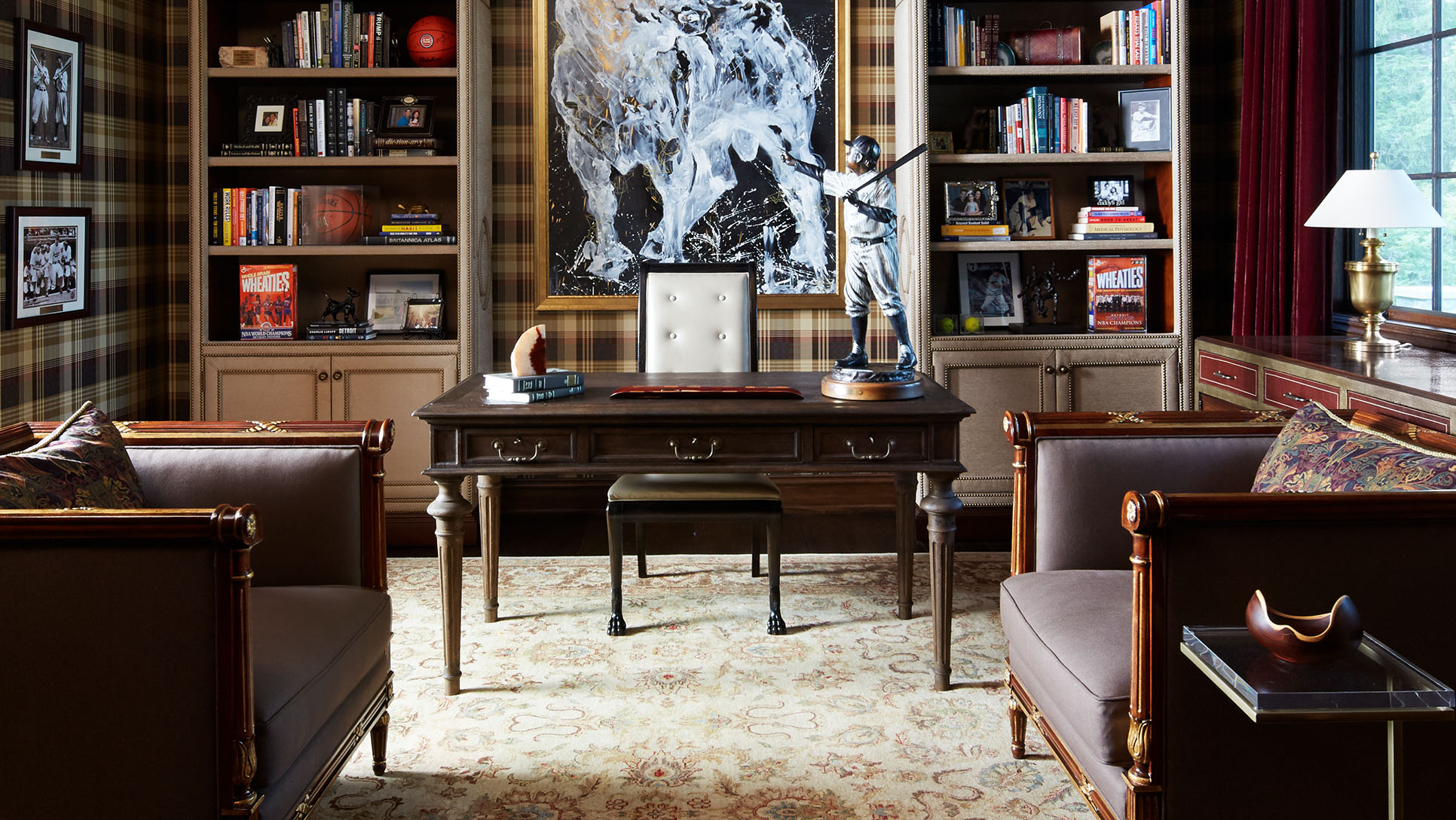
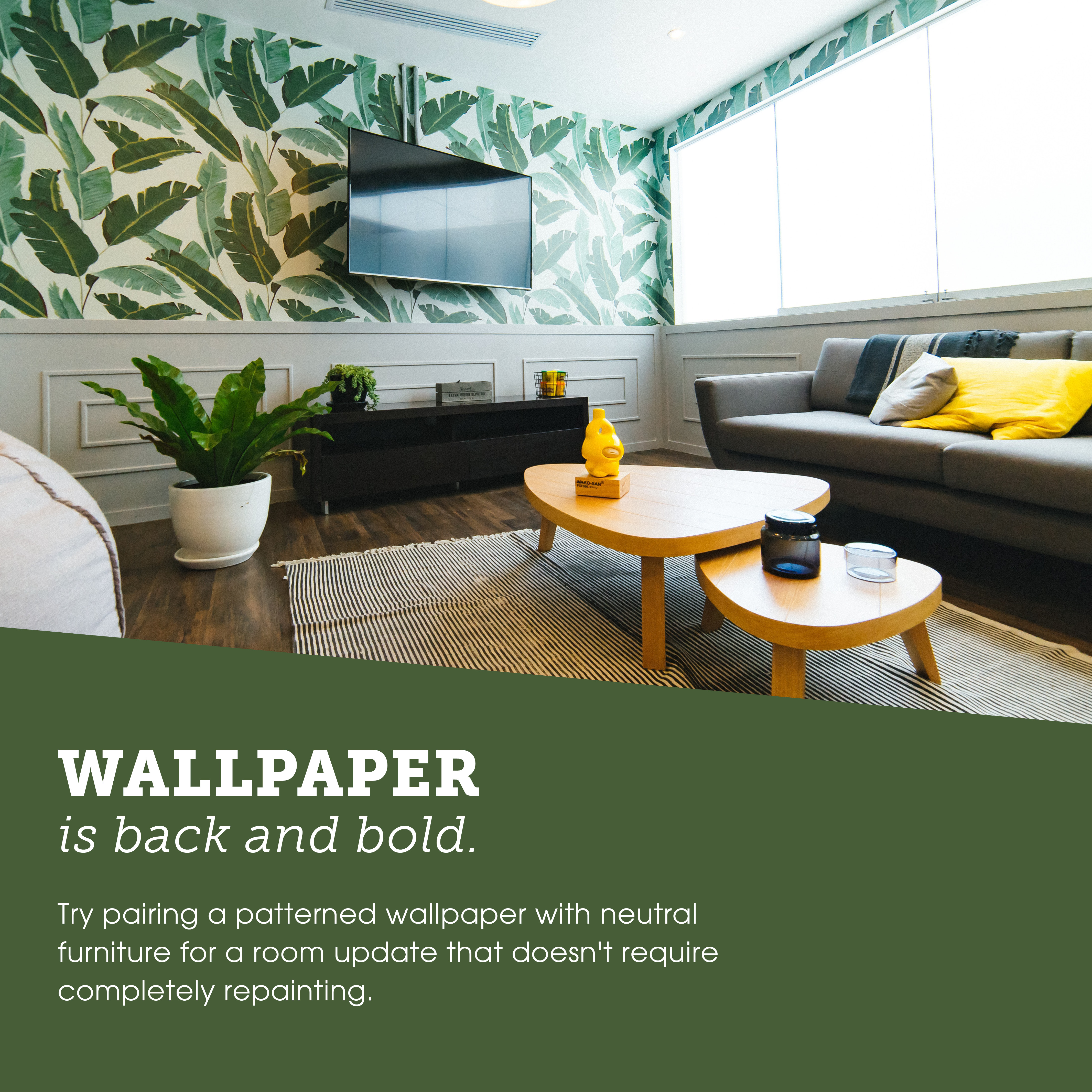
The plaid wallpaper in the office is a bold print. What influenced that decision?
The husband is a well-dressed businessman, so I studied his wardrobe for inspiration. Plaids, houndstooth, stripes, and other menswear trademarks were staples in his apparel choices, so the wallpaper seemed to be a natural choice to reflect his style for the gentleman’s study.
Tell us about the artwork. Did it belong to your clients, or did you help choose it for the design?
The clients did own some artwork previously, and we worked it in. But some pieces I chose for them, like the resting ballerina in the formal parlor. The bold charging bull is a custom piece by an artist from Asia, and including it was actually the husband's idea. So he consulted with me on it for sizing, frame finish, etc. I’ve always believed that the best design comes from collaboration with the people you’re working with, and that goes both ways for designers and clients.
How did the clients react to the finished project?
The ranch took roughly two years to design, build, and furnish, so when we unveiled the home to the clients, it was pretty emotional for them. The wife was moved to tears, which naturally got the hubby a little emotional because he was so happy to see his wife and daughter overjoyed at the results. In fact, the more I think about it, laughter and tears were all around—even for my staff. And witnessing those reactions is the best reward for a professional like me. Our job is to improve people’s quality of life, and when you see the impact of your designs on others’ happiness, well, it’s just the most accomplished feeling.
For more info, visit coreydamenjenkins.com
Use these tips to achieve
Corey Damen Jenkins's signature style.
Share this modern design feature and the accompanying decorating tips on social media!
